
A FACE-FIRST DEEP Dive into Color VALUE
“Value does all the work, but color gets all the credit.”
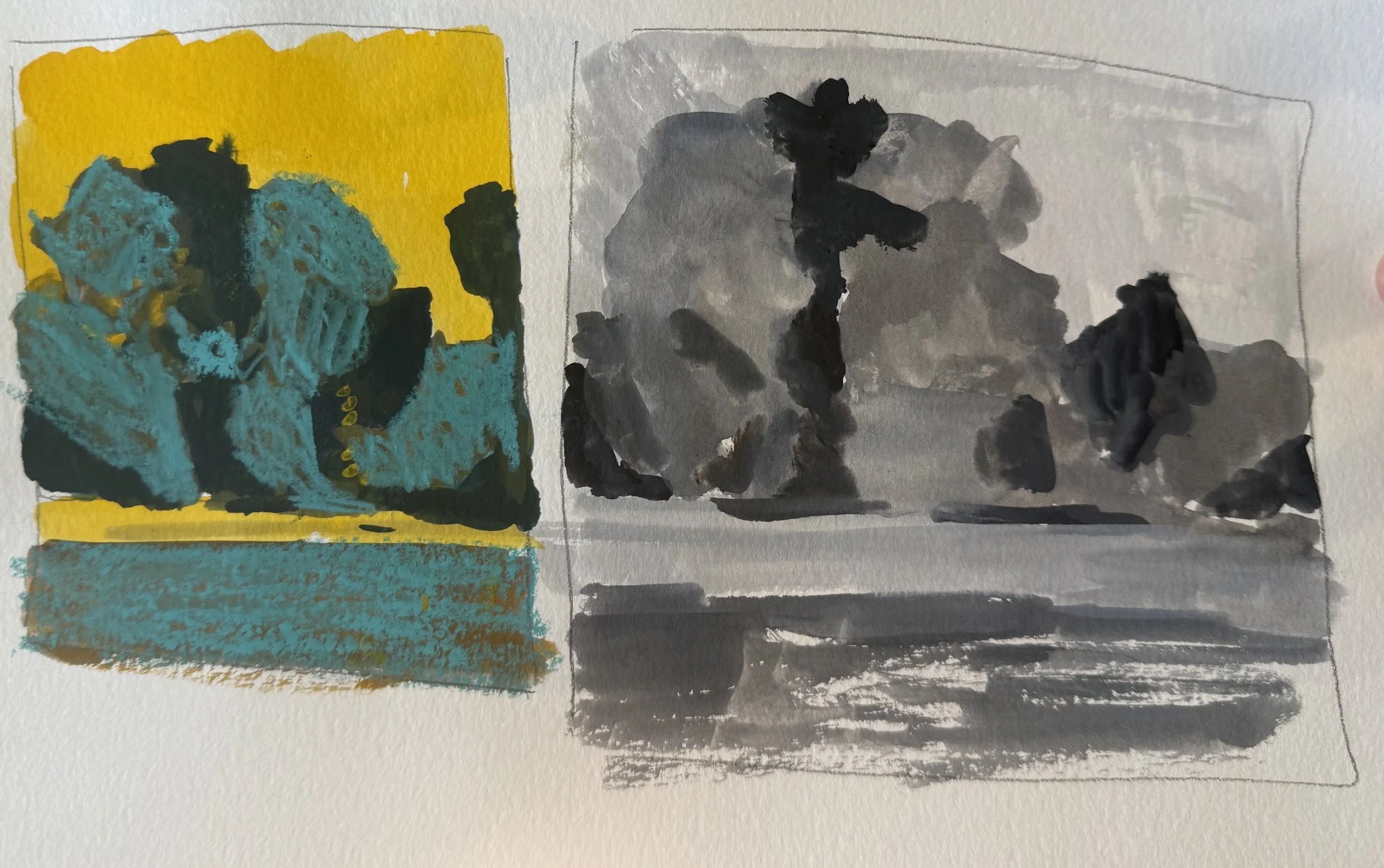
Value study in grey and then in color.
Have you ever looked at a painting and thought
“WOW!
This is wonderful - there is just something about it!
I’d eat beans and toast for a decade to take it home with me right now!”
Versus.
Viewing a painting that is good, but… something is off; you can’t quite put your finger on it?
If I were a betting woman, I’d say value was the culprit and the hero in both scenarios.
Value refers to how light or dark something is, no matter the color.
It is the scale from white to black, or the lightest of light blue to the darkest of dark navy blue, and getting it right is essential for making a painting pop or fall flat.
I thought I understood value, and while I could define it, I didn’t really grasp how to work with it while painting.
The INSIDERS SECRET was a stupid little grey card.
More on that later.
A while back, value smacked me right in the face and said
“HERE I AM! You shall never ignore or underestimate me again!“
It was right, because now that I see it, I can’t unsee it.
I spent the following month, maybe longer, main-lining everything I could about color value and how to leverage it correctly when painting.
How & When Value spoke to me:
I was on my phone scrolling through an online gallery of paintings, hundreds if not thousands of paintings. I don’t even remember what I was looking for, but keep in mind I was on my phone, and each image was literally a thumbnail. There were probably 15 to 20 paintings to a page/phone screen.
Think of your camera roll.
It was similar.
As I scrolled, some paintings called out to be clicked and enlarged, while others sat quietly, saying nothing.
After 20-plus pages of paintings on very similar subject matter, I began to question why some called out while others did nothing but take up digital space.
Or why some of them should have been good, but upon further inspection were missing something, and the something wasn’t obvious.
And then it CLICKED!
It was more like rust-on-rust creaking, crawling therwunk, as the part of my brain that didn’t want to learn a new highly complex idea finally let go and began chugging along, trying to catch up.
V A L U E !
The paintings that spoke up, the ones with a certain Je ne sais quoi even with only a few pixels to their name, were spot on in their value.
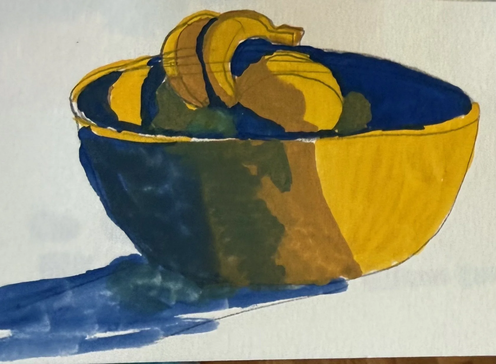
Lightest light (the paper), light, midtown, to the darkest dark.
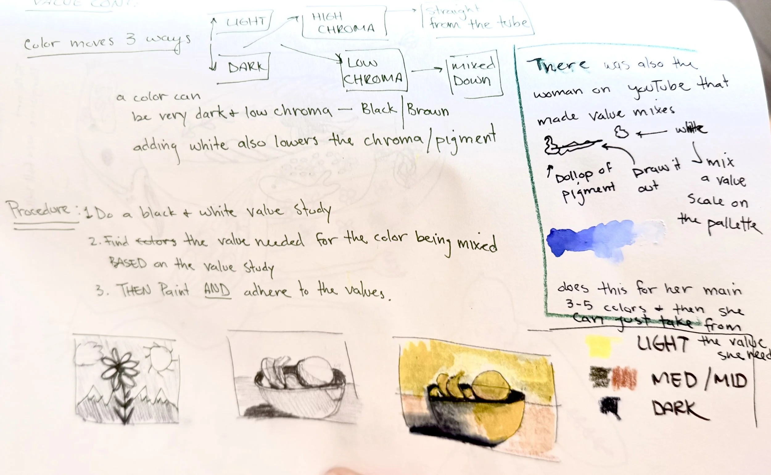
Color moves THREE ways!
The image above is from my sketchbook; I was taking notes, watching YouTube tutorials, and painting - simultaneously. That's why you can’t really read what I’ve written.
I’ll transcribe for you:
Section #1
Color moves 3 ways -
up (light) and down (dark)
High chroma (straight from the tube) - Low Chroma (mixed down)
A dark color can be low chroma -black/brown.
Adding white also lowers chroma.
A light yellow straight from the tube can be a high chroma color, and a dark color straight from the tube (brown) can be low chroma.
Procedure:
Do a black, grey, and white value study of your image.
Find the color that corresponds with the black-grey value.
Then paint your image with color AND adhere to the values.
Section #2:
There is a woman on YouTube who makes value mixes on her palette before she starts painting - a dollop of paint straight from the tube and then a dollop of white at the other end, with each value in between.
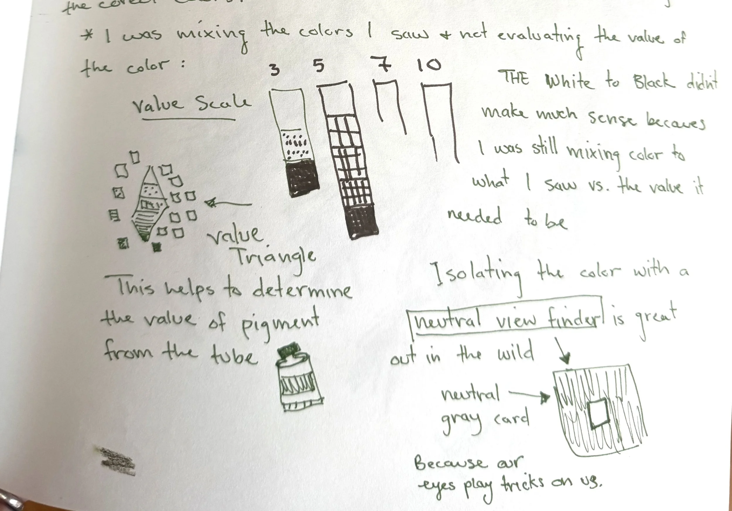
Additional sketchbook notes - transcribed below.
I was mixing the colors I thought I saw and NOT evaluating each color's relationship to the values of the other colors in the painting.
I understood the white-to-black value scale, but it didn’t make sense because I was still mixing the color to what I “thought” I saw instead of the value it needed to be.

A rudimentary attempt to illustrate color value relationships
A bright light lights the left side of this person's face, casting the right side into shadow.
The left ear highlights are done in bright white to indicate the light source, while the right ear still has lights and darks even in shadow. If you were painting this face and didn't consider the context or the relationship of the values, and made the right ear highlights as bright as the left, the image would look off and confusing.
The eyes are the same - the left is white, while the one in shadow uses the color of the paper to give it a lighter appearance.
Isolating the color - A neutral gray viewfinder is a must-have tool for painting out in the wild.
When you look through the neutral gray card at a color, it blocks out the surrounding colors, allowing your eye to see what is actually there, not what your brain assumes should be there. The brain thinks it is very smart, so it fills in the info it believes should be there, not what’s actually there.
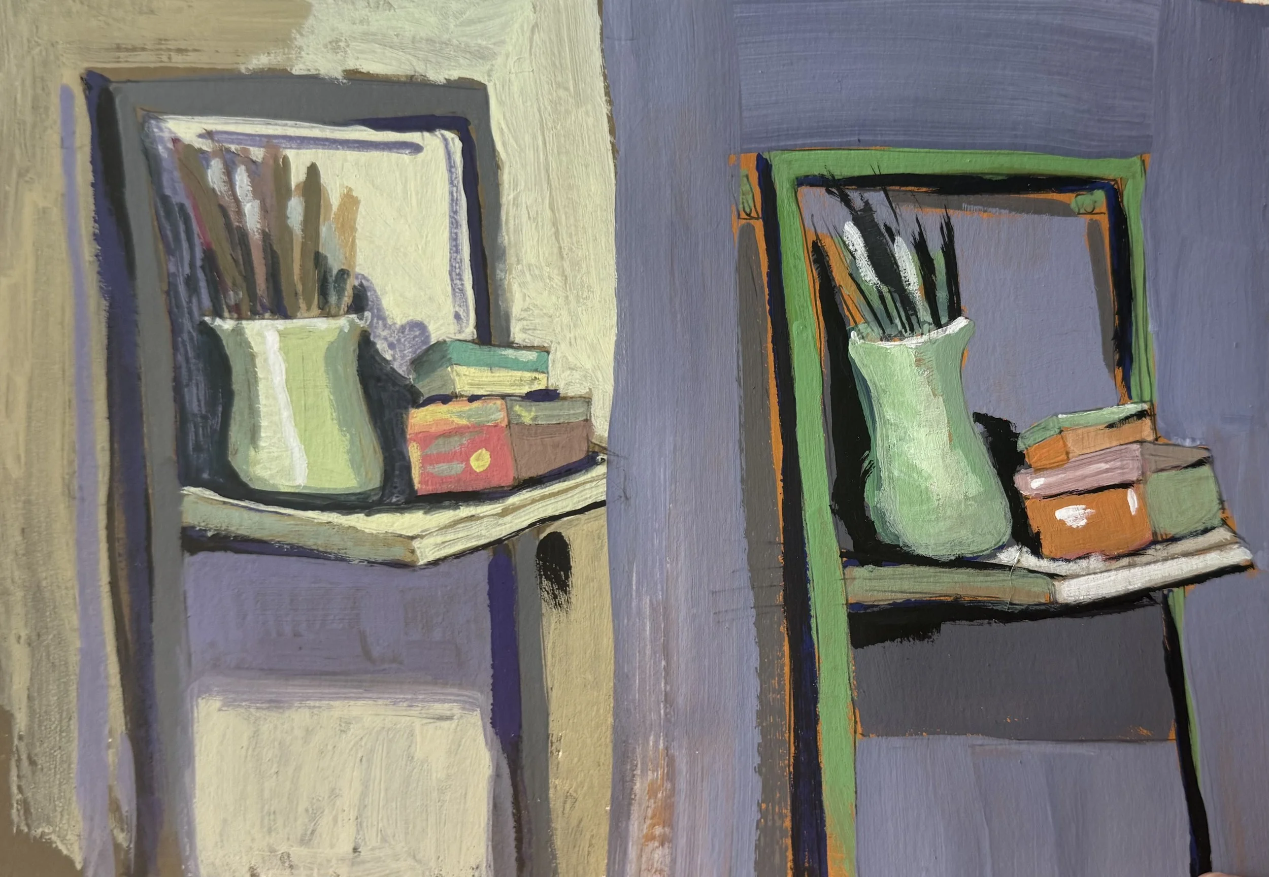
Value study using different colors.
The other YouTube creator that I learned so much from was Sorry Not Sorry Art School - all of her videos are very valuable and no-nonsense, but this one was particularly helpful in my quest to understand value.
Here is a YouTube playlist of all the videos I watched.
I also watched several classes on Skillshare, but it is a paid subscription platform, so I’m not linking them here. I just searched for Color Value and went from there.
That's why value is so important when painting, drawing, or creating any image. Once you understand value, your skies can be pink, green, grey, or violet.
Your mountains can be red, pink, gold, or any other color, and they will look amazing - as long as the value is correct!
Go forth enjoy and paint!